
Defiant Act of Hope
by Gianna DiBartolomeo (updated June 2019)
Dear Reader
This manuscript intends to provide a general framework to understand my practice. Using recently completed works as examples, I shed light on how I approach my work, flesh-out the main elements of my practice, provide insights into my thought processes, and identify artists with whom I align in thought or practice.
While similarities and differences between artists can be useful for comparison and analysis, the danger is that, in today’s art world, groupings beget labels and categories. Artists whose works defy categorization can get overlooked. An artist who is hailed for a particular style will most likely have any work that does not fit this category pushed to the wayside. I echo a sentiment expressed by artist John Baldessari: as one looks closer, one will note that each artist is unique, and labels really do not apply.[1] I believe each artist and their practice is unique and should be seen as such. I am more interested in the particular voice of each artist versus the grouping of artists together under a single label.
Since not comprehensive in nature, this manuscript should be seen as an introduction. Similar to curator Robert Storr, I view my work and practice as the “beginning of a renewable acquaintance with someone or something it will take a long time to know well and whom one will never know completely.”[2] Let the introduction begin.
My Practice in One Paragraph
Much of life is measured by points – birth, graduation, insert-your-own-milestone-here, marriage, promotion, death. However, the reality is that most of life really occurs between the points. These spaces are ripe with possibility – things are not fixed. Even on an emotional level, we may speak of happiness, sadness, and anger, and miss the nameless emotions in-between. While the English language appears ill-equipped to discuss these spaces, I find I can talk about these emotional in-betweens visually by aligning concept, material, and process.
Three Cornerstones
My concept, material, and process can also be described as the three main constants – or cornerstones – which answer the “why,” “what,” and “how” of my practice. The backstory or concept in my work is the “why.” For instance, the death of a close friend, a selfless act from a perfect stranger, or even earning my motorcycle’s license can be a driving force (pun intended) for a concept I wish to explore.
My materials are the “what.” I source my materials from the seemingly ordinary and mundane, found in my everyday life. Raw materials can range from army men to zippers. Since my work is about real-lifeevents and ideas, I find it appropriate to use the materials found in my environment. I am interested in emphasizing the magic in these commonly overlooked resources and liberating them from their all-too-narrow context. The processes I employ to make the work are the “how.” Usually, these techniques involve a lot of repetition, such as replicating marks, pinning copious amounts of sequins by hand, or covering walls with a clipboard grid.
Each of the three cornerstones – how, what, why – are equally important and work in tandem with one another. It is as though I have three file cabinets in my mind: one for concepts, one for materials, and one for processes I wish to explore. I go about my daily routine and am constantly filing data away. A regular trip to Home Depot turns into an opportunity to peruse the aisles, to take a mental inventory of materials at my disposal. Going to the mall inspires color combinations. Part of my practice includes regularly rifling through the cabinets. I check if an idea, material, and process align. Sometimes, as artist El Anatsui says, “there are long periods of gestation before an idea of what to do comes.”[3] My green light to move forward with new work occurs when the three cornerstones align.
|
Trivial Pursuit Aligning my concepts, materials, and processes also underscores two basic premises central to my work. First, visual art, at its core, is a form of communication. Humans are generally on a quest to live a purposeful life that meaningfully connects with others. Second, I believe in shared experiences. We may, at times, think ourselves alone in some experience–big or small–only to realize many people share this experience in their own way. So, at the core of my practice, lies the belief that as an artist,I am imbued with creativity and perspective in order to make work that connects with others. There is a sense of comfort and belonging when one can relate with others. Growing up, I loved watching Seinfeld – the show about nothing. For me, the show was about everything: everything that could easily be overlooked. Even watching reruns today, I marvel at how the series gives justice to observations and situations that some might be tempted to call trivial. In one episode, Jerry gets annoyed with Elaine’s close-talking boyfriend. Jerry recognizes that feeling one’s hot breath on your face as they invade your personal space is off-putting. I feel understood and validated. For me, Seinfeld works in a similar way to artists who bring a sense of wonder to the seemingly banal, such as photographer Stephen Shore (Fig. 1) and multi-media artist Robert Therrien (Fig. 2). In both cases, their work triggers an awareness of what is possible: prying our eyes open to a fresh way of seeing the same ole’ same ole’. Similarly, the grit and glamour of life embody the subject matter of my work: the places we go, the bumps in the road, and the discoveries along the way. To borrow from artist Scott Grieger: my inspiration “resides in the commonplace experiences and normal modes of perception.”[4] Nothing is too trivial. I take the vulnerable step of putting myself out there saying, “This is my experience and here is my perspective.” I initiate a conversation – allowing viewers to see themselves (or not) in my work. My work may be steeped in personal history, but the materials I use are easily recognizable and generally come charged with specific associations for viewers. Thus, when complete, the work transcends its original meaning. Artist Jim Hodges notes that “memories are transmitted through materials.”[5] I am opening up a personal conversation in a public space, encouraging viewers to attach their own associations to the work. In this way the work grows – the conversation evolves. Cubicle For Cubicle (Fig. 3), a graduate studio installation, inspiration struck with a common conversation: cubicles are scary confining places. It was my first week in the MFA program at Florida International University. I entered the program imagining that this three-year journey would be a place – both figuratively and literally – of artistic free-thinking. It would be a place where I would build my creativity, explore new realms of creative engagement, and be surrounded by all things artistic. Most importantly, though, it would be a retreat from my fluorescent-lit, nine-to-five, office day-job. |
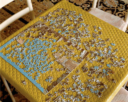
Fig. 1, Shore, Stephen, Lookout Hotel, Ogunquit, Maine, July 16, 1974, 1974, chromogenic color print, The Museum of Modern Art, New York, http://stephenshore.net/photographs/uncommon/9.jpg
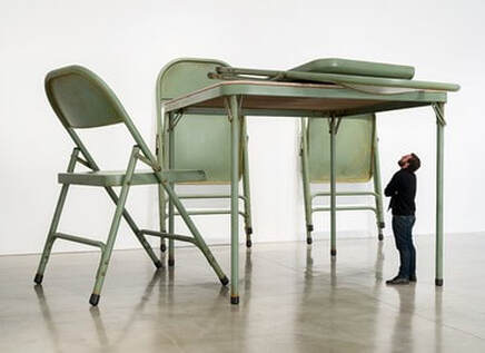
Fig. 2, Therrien, Robert, No title (folding table and chairs, green), 2008, paint, metal, and fabric, Gagosian, New York, https://www.artsy.net/artwork/robert-therrien-no-title-folding-table-and-chairs-green
|
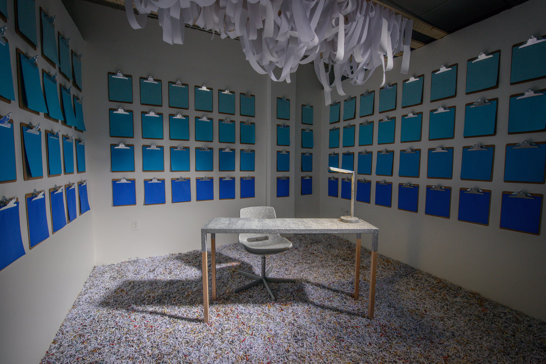
Fig. 3, DiBartolomeo, Gianna, Cubicle, 2017, table, chair, lamp, extension cord, clipboards, paper, glitter, glue, metal, and wood
|
Imagine my shock and horror when, after slipping the freshly cut key into the door of studio #116, I was confronted with, of all things, a fluorescent-lit cubicle—a literal ten-foot by ten-foot cubicle (Fig. 4). I audibly gasped. Nausea coursed through my body. I slammed the door as quickly as I could and promptly left. This was a scary, confining, and confusing place to make art. After much thought, I decided not to make art in my studio. Typically, cubicles are not environments that foster out-of-the-box thinking. I did not want my cubicle to be a place where my inspiration went to die. Instead, my studio would become the art. The studio was my blank canvas. ForCubicle, I re-imagined the idea of a cubicle space and was reminded of South Korean artist Do Ho Suh. Similar to me, Suh’s work is informed by personal experiences and “highlights the important connections we make between physical places and memory.”[6] Using memory as my guide, I recalled that when younger, I spent a lot of time waiting in my dad’s office. One more phone call, appointment, or letter before we could leave. Office supplies quickly became toys. Staplers were fun. Liquid white-out was a mini-paint set. I smeared it over fresh pen and highlighter ink. Multi-colored plastic-coated paper clips became hair clips, long chain necklaces, earrings, and bracelets. |
Fig. 4, DiBartolomeo, Gianna, Studio #116, 2016
|
I imagined I was a little girl again, stuck in a cubicle. Armed with only the supplies found in a typical office workplace and the glitter of a child, how would I arrange my cubicle? Clipboards with gradations of blue paper became windowpanes looking out to the clear blue sky (Fig. 5). Rolls of calculator tape form a cloud chandelier (Fig. 6) which hovers over a shimmering desk, chair, and lamp (Fig. 7) – all ready for inspired work. A paper-shred shag carpet completes the room (Fig. 8). The installation reads as place where one’s work seems like play while mocking the prevalent idea that working more hours brings more happiness.
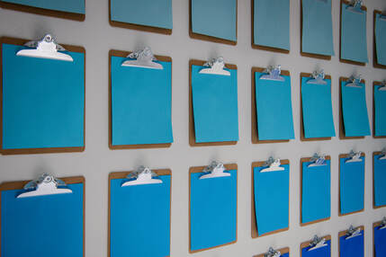
Fig. 5, DiBartolomeo, Gianna, Cubicle (detail), 2017, table, chair, lamp, extension cord, clipboards, paper, glitter, glue, metal, and wood
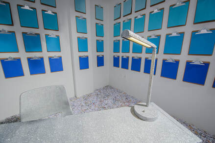
Fig. 7, DiBartolomeo, Gianna, Cubicle (detail), 2017, table, chair, lamp, extension cord, clipboards, paper, glitter, glue, metal, and wood
|

Fig. 6, DiBartolomeo, Gianna, Cubicle (detail), 2017, table, chair, lamp, extension cord, clipboards, paper, glitter, glue, metal, and wood

Fig. 8, DiBartolomeo, Gianna, Cubicle (detail), 2017, table, chair, lamp, extension cord, clipboards, paper, glitter, glue, metal, and wood
|
|
Paralleling Suh’s The Perfect Home II (Fig. 9), Cubicle explores personal experiences and memory in relation to space. Suh’s work relates to personal identity and displacement. His piece re-creates, to scale, his former New York apartment in the Chelsea district, which he called home for nineteen years.[7] Similarly, as many can relate to living in cramped spaces, Cubicle relates to those who work in confined spaces. As I explored my feelings toward my new studio—somewhere between haunting and wonderment—I encouraged my viewers to do the same: explore and re-imagine their own confined spaces.
In-between What I felt toward my graduate studio was real, but any attempt to verbalize that feeling was futile. I could rattle off a list – perplexity, nostalgia, angst, curiosity, bewilderment, surprise – but none of these would be quite right. I am interested in those hard-to-define emotional in-between spaces—the spaces between concrete pinpointable feelings. At first, the lack of vernacular can be seen as barrier to communication—an annoyance even. However, I have come to see the beauty in it: my work says more than could ever be articulated with words. |
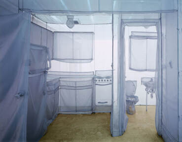
Fig. 9, Suh, Do Ho, The Perfect Home II, 2003, translucent nylon, Brooklyn Museum; Gift of Lawrence B. Benenson, photo courtesy of the artist and Lehmann Maupin Gallery, https://www.brooklynmuseum.org/exhibitions/one_do_ho_suh
|
In art theory, this in-between could be associated with affect, which has been defined by Dr. Alpesh Patel as “feeling before meaning.”[8] One may sense something, before it manifests into one concrete thing or another. This in-between space provides fertile ground, ripe with possibility. There is freedom to become one thing or another since nothing is fixed.
In psychology, the in-between could be referred to as a liminal state. Ethnographer Arnold van Gennep likened this liminal state to a rite of passage.[9] According to van Gennep, three states comprise the passage, “the separation, or detachment of a subject from its stabilized environment; the margin, which is an ambiguous state for the subject; and the aggregation, in which the passage has [been] completed and the subject has crossed the threshold into a new fixed, stabilized state.”[10] The liminal state – the in-between – is that second ambiguous state.
For van Gennep, this period transfers “the subject from the original site to the new site.”[11]For me, this stage holds the most interest because of its ephemerality (one does not stay in this state forever), ambiguity (while in this state, one is not sure of the outcome), and potential (while in this state, possibilities are endless). In life, perhaps it is akin to waiting – where there exists a tension and buildup for an unsure outcome. These are powerful shared feelings that can be easily overlooked and forgotten once one crosses the “threshold” – getting the job, passing the test, meeting the right person, or arriving at the destination.
|
Bernini In-between Artists depicting the in-between in art is not new. Italian sculptor Gian Lorenzo Bernini sets himself apart from his predecessors and contemporaries with his combination of realistic representation, emotional weight, and depiction of the in-between moment – as opposed to a before or after. These aspects can be seen in his sculpture, David (Fig. 10). David, a life-size marble sculpture, depicts the biblical character of David. David, a young Israelite shepherd, was tasked with bringing food to his older brothers who were setting up camp and preparing for war against the Philistines. Upon his arrival at camp, David accepts the challenge of the opposing Philistine giant war hero, Goliath, for a single combat match. Goliath, armed with bronze armor, a spear, and javelin is defeated by David, armed with mere stones and a sling. Bernini’sDavid embraces the Baroque ideals of action, drama, and humanization. Yet, most interesting is Bernini’s selection of that in-between moment of the narrative. Michelangelo’s David (Fig. 11) is a statue rendered contemplative and calm before the fight, with a slingshot resting over his shoulder. Donatello’s bronze David (Fig. 12) is the after – the head of Goliath at David’s feet. Bernini’s Davidis a split-second of the in-between, frozen in time. |
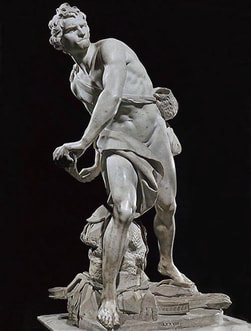
Fig. 10, Bernini, Gian Lorenzo, David, Marble, 1623-24, Galleria Borghese, Rome,
https://arthistoryoftheday.files.wordpress.com/2011/08/bernini-david1.jpg
|
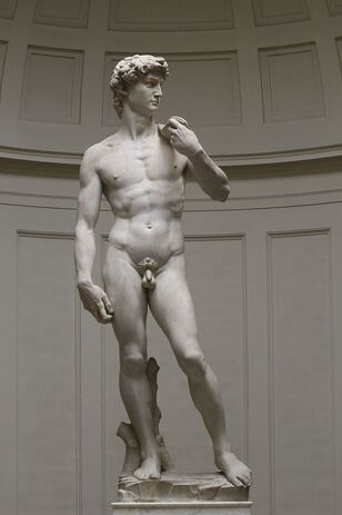
Fig. 11, Michelangelo, David, Marble, 1501-1504, Galleria dell’Accademia, Florence
https://en.wikipedia.org/wiki/David_(Michelangelo)#/media/File:%27David%2z7_by_ Michelangelo_JBU0001.JPG
|
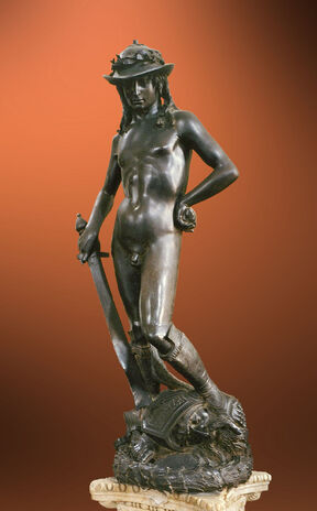
Fig. 12, Donatello, David, Bronze, 1440, Museo Nazionale del Bargello
https://commons.wikimedia.org/wiki/Category:Donatello%27s_David#/media/File:Donatello_-_David_-_Florença.jpg
|
Paper Planes
Like Bernini’s David, my installation Paper Planes (Fig. 13) captures an in-between: instances in which aspirations gain momentum but are not yet fulfilled. It is not the before (identifying goals) or the after (accomplishing them). Rather, it is that ambiguous space where one is making what appears to be progress, but the ultimate outcome is still unknown.
I was inspired by my own dream of earning my MFA. After acceptance into the program, I began sharing the good news with others and became rather surprised by the outpour of negativity I received. I was repeatedly told I was making a big mistake. (Thankfully, I have a supportive family.) Not surprisingly, I commenced graduate school aware of the long road ahead and its uncertain outcome.
|
The responses I received about my decision caused me to recall childhood – a time when you could tell anyone your wildest dreams, and no one would laugh at you or tell you it was impossible. Being a big list-maker, I associated hopes and dreams with the act of writing them down. Many times, a journal can be one’s safe space—a space without judgment where one can be honest and free to express one’s most vulnerable self.
At this time, paper became an important material due to its ability to symbolize this vulnerability. Materials work as symbols and metaphors in my work. I am inspired by the 15thCentury Flemish painters who used symbolism, particularly Jan van Eyck. I became enthralled with this idea when his Portrait of Giovanni Arnolfini and His Wife, Giovanna Cenami (Fig. 14) was decoded in an early art history class. While the painting looked convincing in its own right, it takes a deeper meaning when one realizes that everything in the painting symbolizes something else. As my art history textbook noted, “[t]he small dog may simply be a pet, but it serves also as a symbol of fidelity and its rare breed – affenpinscher – suggests wealth.”[12] I became aware that private information could be hidden in plain sight. Further, something could be used to read as one thing while simultaneously having other meanings. Paper does this, too. There is a brute delicacy in paper, strong and fragile at the same time. However, I also wanted to elicit that childhood state of mind where hopes and dreams fly unfettered. Suddenly, I knew exactlywhat paper I wanted to use. When I was little, my mom kept a stack of bright multi-colored paper on a shelf beyond my reach. The paper was used mainly for special occasions: making birthday cards, thank you cards, or special projects. In my eyes, this was the crème del la crèmeof paper. Sometimes, when I passed the shelf, I would stop and stare longingly at the stack. On the occasions I was rewarded with a few sheets for my own devises, I would carefully plan out their use. This was the paper I selected for my installation. When deciding on what form the paper would take, I once again recalled my childhood. I started thinking about the things I used to make with paper when I was younger. I remember learning to make paper planes from my cousin and feeling a sense of pride and accomplishment when I could make a plane all by myself, without his assistance. That plane design, the Dart, would be my choice for the installation. Paper planes became a clear symbol not only for youth, but for the fragility of one’s plans, ambitions, and hopes. Different sized planes create visual interest and represented how some dreams can be grander than others. It also symbolized multiple dreams developing at different rates. The studio/installation space represented one’s mind. Maintaining the same paper plane design for all the planes suggested they are from the same maker. In my installation, the planes are taking flight, but are not soaring, hence my decision to include the ground – artificial green grass. In one sense, the grass would seem tall, suggesting an open landscape where grass can be seen for miles. Conversely, having the grass high on the studio walls would give the viewer a sense of confinement. By not covering the ceiling, it allows room for the idea that, with more momentum, the planes could fly up and out of the studio. The grass highlights the duality and coexistence of freedom and limitation. |
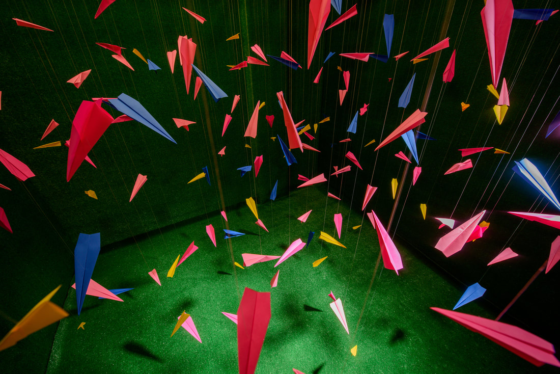
Fig. 13, DiBartolomeo, Gianna, Paper Planes, 2016, paper, glue, monofilament, artificial grass carpet, metal, and wood
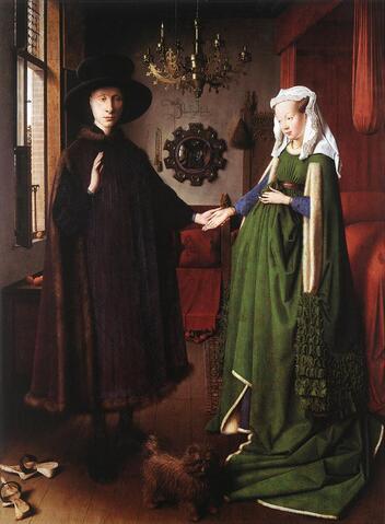
Fig. 14, van Eyck, Jan, Portrait of Giovanni Arnolfini (?) and His Wife, Giovanna Cenami (?), 1434, oil on oak wood, National Gallery, London,
https://commons.wikimedia.org/wiki/File:Jan_van_Eyck_Portrait_of_Giovanni_Arnolfini_ and_his_Wife.jpg
|
Marshmallow Meat
This idea of co-existence reminds me of something that F. Scott Fitzgerald wrote: “intelligence is the ability to hold two opposed ideas in the mind at the same time.”[13]Paper Planes explores this concept. Another example of this is the famous Stanford marshmallow experiment.[14]
In this experiment, a child is seated at a table in a private room. After which, the researcher places a single marshmallow in front of the child. The researcher then gives the child an option: after the researcher leaves the room, the child can have the single marshmallow, or if the child waited, upon the researcher’s return, the child could have multiple marshmallows.
While this experiment is usually used to underscore delayed gratification, the experiment also shows how one can entertain two conflicting ideas: “I want the marshmallow now” and “I want three marshmallows later.” Perhaps the in-between is just that – the place where multiple ideas co-exist. Hand-in-hand with this co-existence idea is the thought that if multiple ideas can co-exist, so, too, are there multiple ways of looking at something.
Life in the Dash
A few years ago, I grappled with two co-existing ideas of my own. My grandfather was in the hospital again. The doctors were saying this was the end. The priest gave him his last rites. Yet, at the very same time, this seemed all too familiar. During the previous hospitalization a few months earlier, we were told the same exact thing, “Say your goodbyes, he’s not going to make it out of here.” But he did. My grandfather confessed he wanted to live forever, and quite frankly, it was looking as though he might just do it.
This emotional rollercoaster – “This is the end.” “Oh, wait, no it’s not.” – continued with multiple hospitalizations, surgeries, and what his doctors called, “medical miracles.” Finally, his health got to a point where he could be cared for at home with a nurse and family members at his bedside twenty-four hours a day. He feared being alone. We ensured that he would always see a loved one’s face.
Watching the slow and painful process of death messes with one’s head. I felt as though I was in a fog, but, aware of being in the fog at the same time. I knew events were happening, deadlines passing, and life was moving on without me, but I could honestly care less. It was the opposite of feeling numb. Perhaps the best way of explaining it was that I was feeling too much. I was feeling so much that my mind was saying that it did not have the capacity to process another feeling. My core was fracturing.
I sat at my grandfather’s bedside, watching him jolt out of restless sleep, surrounded by all these flowers: some whole and blooming while others caught in various stages of decay – wilting with petals falling one-by-one. Staring at the flowers and pieces of flowers for much too long, I began thinking about how to visually capture this in-between moment. It was a space in between milestones marked by an acute emotional state where one is unable to make out the details. Embroidery, abstraction, and color became tools for me to explore this idea.
|
Fragmented Flowers Embroidery was the perfect symbol for tradition as it dates back to the second millennium BCE.[15] It also gives a warm homey feel. At this time, I was thinking about my family’s history and lamenting the fact that we do not have any multi-generational heirlooms. My grandparents emphasized personal relationships over material possessions. I saw the embroideries as filling this heirloom void. I felt an urgency to make these embroideries – relics – that signified history and tradition for my family as we were losing our patriarch. In the same vein as Turkish artist Defne Tesal’s contemporary embroideries (Fig. 15), I was also exploring pain, peace, and chaos.[16] While Tesal was embroidering her view from a window seat, I was embroidering my view: the view of flowers from a seat next to my grandfather’s bed (Fig. 16). I noted how flowers themselves are neutral. They can mark a variety of occasions: some happy (anniversary, congratulations, romance) and others, not so (funeral, get well, cheer up). This one motif could be seen from multiple perspectives: while flowers might make one smile, they might make another cry. Just as I was experiencing feelings that could not be explained or accurately described, so I wanted the work to reflect this, too. I found myself asking the same question artist Julie Mehretu asked herself, “How do I construct or make images in ways that deal with things that we don’t have the proper language for?”[17] Abstraction became the vehicle to discuss this. Because of abstraction’s inherent inability to “explain,” abstracting flowers came to represent my emotional in-between space. Mehretu notes that her work is not a depiction, rather she “want[s] the work to be felt as much as read.”[18] My abstracted flowers stood for this in-between state I was in – would my grandfather live or die – and the un-surety of the outcome. In the same way, the flowers are in an in-between state: not quite flowers, but not quite not flowers. They implied possibilities: perhaps the geometric shapes would get clearer and be more readable as flowers or perhaps they were going to further abstract and become something else completely. Color was my vehicle to signal emotions. My early pieces from this series – made during the end of my grandfather’s life – employ somber and muted corals, greens, and pinks. Other pieces, later in the series, utilize brighter and more colorful hues such as bright fuchsia, sunny yellow, and cobalt blue (Fig. 17). At some point, I began selecting colors purely based on feeling. I would look down at my embroidery box of neatly wound floss organized by color and select whichever hue spoke to me, whether it made sense visually to the pattern I was working on, or not. Russian artist Wassily Kandinsky might say that my use of color “play[s] different musical notes, causing vibrations of the soul.”[19] By working this way, the pieces became portraits of feelings –showcasing the range of nameless emotions one can feel. |
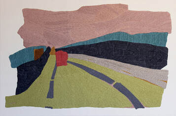
Fig. 15, Tesal, Defne, Road II, 2012, yarn on fabric, https://www.defnetesal.com/window-seat
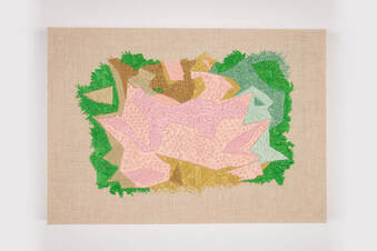
Fig. 16, DiBartolomeo, Gianna, Fragmented Flowers I, 2016, hand-embroidery on linen
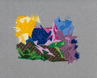
Fig. 17, DiBartolomeo, Gianna, Fragmented Flowers XIII, 2017, hand-embroidery on cotton
|
|
Dear Grandpa
I paused working the Fragmented Flowers embroidery series after my grandfather passed away as I was abruptly confronted with a new set of emotions. My grandfather’s death made my grandmother’s passing seven years earlier seem final. I know it sounds strange – even writing it. I felt the finality and knew I had to come to grips with the fact that I have no living grandparents. Suddenly, I had so much I wanted to say. So, I decided to hand-embroider a letter to my grandfather, saying what I needed to say in that moment. Dear Grandpa (Fig. 18) is a hand-embroidered, larger than life letter. Upon initial glance one might not even notice the embroidered scrawl: the cream thread provides little to no contrast to the gauzy cream fabric. One immediately gathers a sense of ephemerality upon viewing the weightless letter float from the rusty, sturdy, and well-used typewriter borrowed from my grandfather. The actual words of the letter are not important, rather, the idea of sending a message heavenward is stressed. Yet, if one wants to read what I wrote, the words are visible. Excess fabric falls from the typewriter onto the floor – the letter is not complete. In reality, the letter says more than what appears. As I was hand-embroidering the piece, stroke by stroke, there was a longer conversation happening. So, on the surface is a letter but embedded in the piece is a conversation. |
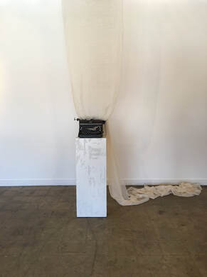
Fig. 18, DiBartolomeo, Gianna, Dear Grandpa, 2017, hand-embroidery on fabric, typewriter, and wood plinth
|
Labor of Love
The intense concentration and focused attention required for the making of my work brings me to a meditation-like state. This state is a reprieve from all the input received throughout the day. Engaging in laborious processes makes me feel as though I am resisting the information-overloaded culture in which we live. Life is a journey that should not be rushed. As writer Jeanette Winterson notes, “[o]ne of the casualties of progress is peace and quiet.”[20] My practice affords me this luxury.
It is a time of rumination that brings about mental and emotional clarity. Oleg Grabar, French-born art historian and archeologist specializing in Islamic art and architecture, notes that so much art has been made through this meditation on one’s self.[21] It is no surprise that I agree with his conclusion that when the artist emerges from the time of reflection, “[i]t is no longer a meditation but a work of art.”[22] In this state, time flies and work emerges.
|
Landscape of our Lives
Just as my materials work as metaphors adding layers of meaning to the work, so too does my engagement in process-oriented work. Through repetition, I am making a larger, overarching statement with my works. It is the idea that one thing/one mark/one daily action may not seem like much alone, but when combined, they form the landscape of our lives. In a similar way, Damien Hirst’s giant medicine cabinet, Infinity (Fig. 19), contains over 6,000 meticulously arranged colorful medicine pills. For Hirst, the work symbolizes art’s healing power.[23] However, the work also underscores how accumulation and repetition can take many forms. While some collect stamps or dolls, Hirst’s work can be seen as collection of a repeated action: the accumulation of one’s daily pill taking regimen. My series Moving Mountains (Fig. 20) explores this idea. The works are small and intimate. From a normal viewing distance, the work conjures ideas of mountain ranges or landscapes. Upon closer inspection, one can distinguish tiny single strokes of ink -- small individual lines which are imperfect, made without the use of a straightedge. The work highlights how one makes their own landscape with each daily action taken. It also highlights the power of repetition, no matter how imperfect. Alone, a single stroke seems unimportant – wonky even. However, a thousand strokes become a statement. |

Fig. 19, Hirst, Damien, Infinity (detail), 2001, glass, stainless steel, steel, aluminum, nickel, bismuth and cast resin, colored plaster and painted pills with dry transfers, http://damienhirst.com/infinity
|
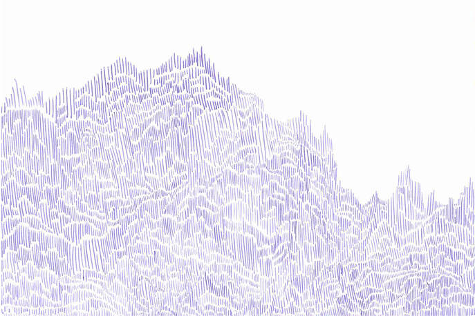
Fig. 20, DiBartolomeo, Gianna, Moving Mountains, 2015, ink on watercolor paper
Hope
After using repetition to embroider a literal statement in Dear Grandpa, I became interested in reflecting life and movement in my work (as opposed to the passage of time and disjointed feelings). I had a renewed sense of hope. Dr. Neel Burton describes hope as in-between optimism and faith [24] (here is that in-between again). Optimism is the belief that somehow, perhaps through luck, other people, or circumstances, one’s future will be successful.[25] On the other hand, faith is typically described as a belief in something “characterized by an absence of verifiable empirical justification or logical proof.”[26] Hope sits somewhere in-between as “a confident expectation in the achievement of a desired state of affairs.”[27] Hope is a mindset.
My work is a defiant act of hope. It is an alternative to the negative and the counterfeit masquerading around us. My practice is fueled by the realization that everything is not black and white – most of life is in-between, with multiple ways of seeing things. I choose to see through the lens of hope.
I am not under the delusion that everything is rainbows and butterflies: quite the opposite. My undergraduate drawing professor said that in order for one to have light, there must be darkness. While he may have been talking about charcoal drawings, I think this idea applies to life. Similarly, philosopher and author, Alain de Botton notes that people who can truly appreciate the beauty in the world have this capacity because they are deeply aware of the ugliness that surrounds them.[28] I connect strongly with this idea and believe that artists tend to gravitate to what is missing.[29] I view my work as helping fill a void of hope.
Glimmer
Perhaps it was experiencing deep and lasting grief that allowed me to rapture in the glimmer of light when it appeared. The ray, however tiny, was a welcome sight. This light inspired the new direction for my Fragmented Flowersseries. I took a cue from painter Stuart Davies (Fig. 21) and used “pre-existing motifs as springboards for new compositions.”[30] I was interested in the abstracted flower patterns for different reasons: form and color.
This new mindset sparked a material change. Switching from embroidery floss to sequins changes the tone of the conversation. In Fragmented Flowers (glimmer) (Fig. 22), I chose metallic gold fabric and shiny holographic sequins –an about-turn from the matte and light-absorbing embroidery. Now, the floral pattern –which previously connoted history, time, and introspection –voices action. The dancing sequins boldly and playfully reflect light.
Fig. 21, Davis, Stuart, Egg Beater No. 3, 1928, oil on canvas, Museum of Fine Arts, Boston, Gift of the William H. Lane Foundation, https://www.nga.gov/audio-video/audio/stuart-davis-in-full-swing/stuart-davis-014-5.html
|
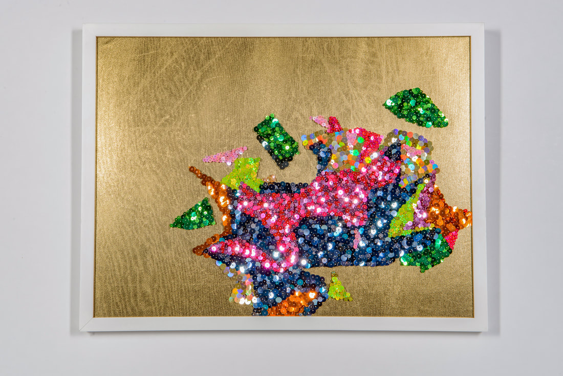
Fig. 22, DiBartolomeo, Gianna, Fragmented Flowers (glimmer), 2018, sequins, pins, fabric, foam, and wood
|
I liked the duality symbolized by the sequins: while spirited, the sequins also speak of fragility and façades – the curious way that things are not always as they appear. On the surface, tiny metallic sequins sparkle and shine. Accumulated, they are grandiose and flashy. Reflecting off one another, the sequins direct one’s attention here or there. With a gentle breeze, they make music. Just as the sequins hang delicately, so easy to reconfigure, we, too, have the possibility of transformation while being reminded of our own fragility.
|
Shine Bright My large hanging piece, Fragmented Flowers (shine bright) (Fig. 23) is a continued metaphor for the in-between, wherein I use actual physical space to represent the in-between. On one hand, the fragments could float further and further apart, becoming their own separate islands. Or, the fragments have the possibility of floating closer together, making a solid flower image. Similar to when one takes a leap of faith, the pattern has been freed from the constraints and safety of fabric, wall, and frame. The fragments are in their most vulnerable state, suspended in space, viewable from all sides. Likewise, when one challenges one’s self to grow and take risks, one can feel exposed and insecure. Taking the risk becomes a defiant act of hope. In Fragmented Flowers (shine bright), each element is meticulously covered with shiny sequins on both sides, with each side displaying a slightly different color variation. The work is multi-faceted – not unlike life – and while being bright and shiny, it also marks ephemerality and delicacy. Just as personal experiences can take on new meaning through the lens of time or additional experiences, so this piece can be seen differently depending on the physical perspective of the viewer. The bold and vivid color palette unabashedly makes a statement that cannot be ignored. |
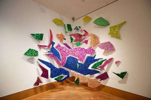
Fig. 23, DiBartolomeo, Gianna, Fragmented Flowers (shine bright), 2019, sequins, pins, acrylic paint, polystyrene, and metal
|
Fragmented Flowers (shine bright) features the same original pattern found both in Fragmented Flowers I and Fragmented Flowers (glimmer). The pattern, which has been repeated numerous times in my work, is based on an image of a lotus flower. Lotus flowers are rich in spiritual and religious symbolism. Some even consider it one of the most sacred flowers today.[31]
For me, the lotus flower is a symbol of hope. Endowed with a colorful bloom, its roots are based in the mud. Each night it submerges “into murky river water, and—undeterred by its dirty environment—it miraculously re-blooms the next morning without residue on its petals.”[32] The lotus’ ability to plunge into grime and emerge unscathed resembles hope. As poet and former Czech Republic President Václav Havel notes, hope “emerges out of the muck of absurdity, cruelty, and suffering, and reaches not for the solid ground of what is certain, but for what is meaningful.”[33] Moreover, Havel further notes that hope is not a reflection of current situations and the world around us, but rather, a state of mind.[34]
End with Hope
Just as my artwork is inspired by life, I hope my work inspires the lives of others. I want viewers to see the mundane with fresh eyes, to find comfort in knowing that in-between emotions are shared by many, and to entertain the thought that there is another way of looking at something. In life, sometimes one cannot see the light at the end of the tunnel. However, not being able to see the light does not change the fact that it exists. Occasionally, one needs a friendly reminder of this fact. This is why my work always ends with hope.
Endnotes
[1]Tina Kukielski, Susan Sollins, and Diana Al-Hadid, Being an Artist: Artist Interviews with Art21(New York, NY: Art21, 2018), 21.
[2]Paula Marincola, Robert Storr, Lynne Cooke, Ralph Rugoff, Carlos Basualdo, Thelma Golden, Glenn Ligon, Detlef Mertins, Paola Antonelli, Bennet Simpson, Jeffrey Kipnis, Glenn Andamson, Iwona Blazwick, Mary Jane Jacob, Mark Nash, and Ingrid Schaffner, What Makes a Great Exhibition?(Philadelphia, PA: Pew Center for Arts & Heritage, 2016), 27.
[3]Tina Kukielski, Susan Sollins, and Diana Al-Hadid, Being an Artist: Artist Interviews with Art21, (New York, NY: Art21, 2018), 199.
[4]Linda Weintraub, In the Making: Creative Options for Studio Art Classes(New York: D.A.P./Distributed Art Publishers, 2003), 150.
[5]Olga Viso, “Choreographing Experiences in Space: Olga Viso Interviews Jim Hodges” Hammer Museum, October 16, 2014, https://hammer.ucla.edu/blog/2014/10/choreographing-experiences-in-space-olga-viso-interviews-jim-hodges/
[6]“One: Do Ho Suh” Brooklyn Museum, https://www.brooklynmuseum.org/exhibitions/one_do_ho_suh
[7]Ibid.
[8]Dr. Alpesh Kantilal Patel, “Alpesh Kantilal Patel with Maria Elena Ortiz” (discussion on Productive Failure:writing queer transnational art histories, Books & Books, Coral Gables, FL, January 17, 2019)
[9]Allison Wright, “Liminal,” The Chicago School of Media Theory, The University of Chicago, Division of Humanities, https://lucian.uchicago.edu/blogs/mediatheory/keywords/liminal/
[10]Ibid.
[11]Ibid.
[12]Marilyn Stokstad, Art History:Second Edition, Volume Two(New York: Prentice-Hall, Inc. and Herry N. Abrams, Inc., 2002), 632-633.
[13]F. Scott Fitzgerald, “The Crack-Up” Esquire,(Originally published February, March, and April 1936), https://www.esquire.com/lifestyle/a4310/the-crack-up/
[14]Walter Michael, Ebbe B. Ebbesen, “Attention in delay of gratification,” Journal of Personality and Social Psychology, Vol 16(2), (Oct 1970), 329-337, https://psycnet.apa.org/record/1971-02138-001
[15]“A Brief History of Hand Embroidery,” Textile Research Centre, May 20, 2017, https://trc-leiden.nl/trc-needles/techniques/embroidery/general-embroidery/brief-history-of-hand-embroidery
[16]“Who’s Who in Turkish Culture and Art,” Turkish Culture Portal, http://www.turkishculture.org/whoiswho/visual-arts/glass-artist/defne-tesal-4097.htm
[17]Tina Kukielski, Susan Sollins, and Diana Al-Hadid, Being an Artist: Artist Interviews with Art21(New York, NY: Art21, 2018), 245.
[18]Susan Sollins, “To Be Felt as Much as Read,” Art 21, https://art21.org/read/julie-mehretu-to-be-felt-as-much-as-read/
[19]Rachael Lebowitz, “How to Be an Artist, According to Wassily Kandinsky”, Artsy, June 12, 2017, https://www.artsy.net/article/artsy-editorial-artist-kandinsky
[20]Jeanette Winterson, Art Objects: Essays on Ecstasy and Effrontery (New York: Vintage Books, a division of Random House, Inc., 1995), 19.
[21]Oleg Grabar, The Meditation of Ornament (New Jersey: Princeton University Press, 1992), 118.
[22]Ibid., 118.
[23]Arthur C. Danto, “Damien Hirst’s Medicine Cabinets: Art, Death, Sex, Society and Drugs”, Damien Hirst,2010,http://www.damienhirst.com/texts/2010/jan--arthur-c-dan
[24]Dr. Neel Burton, “What to Hope for?”, Psychology Today, November 10, 2014, https://www.psychologytoday.com/us/blog/hide-and-seek/201411/what-hope
[25]Dr. Utpal Dholakia, “What’s the Difference Between Optimism and Hope?”, Psychology Today, February 26, 2017, https://www.psychologytoday.com/us/blog/the-science-behind-behavior/201702/whats-the-difference-between-optimism-and-hope
[26]Dr. Shannon Kincaid, Dr. Philip Pecorino, “Philosophy of Religion, Chapter 10, A Definition of Religion: The Interrelation of Faith and Hope,” Queensborough Community College and The City University of New York,http://www.qcc.cuny.edu/socialSciences/ppecorino/PHIL_of_RELIGION_TEXT/CHAPTER_10_DEFINITION/Faith-Hope.htm
[27]Ibid.
[28]“Alain de Botton on Art as Therapy,” YouTube video, 45:16, The School of Life, December 3, 2013, https://www.youtube.com/watch?v=qFnNgTSkHPM
[29]Nato Thompson, Living as Form: Socially Engaged Art from 1991-2011(Cambridge: MIT Press, 2017), 67.
[30]“Stuart David: In Full Swing”, Whitney Museum of American Art,https://whitney.org/Exhibitions/StuartDavis
[31]Katie Robinson, “The Secret Meaning of the Lotus Flower”, Town & Country, April 28, 2017, https://www.townandcountrymag.com/leisure/arts-and-culture/a9550430/lotus-flower-meaning/
[32]Ibid.
[33]Curtis Ogden, “Hope Out of Muck”, Interaction Institute for Social Change, April 16, 2009, http://interactioninstitute.org/hope-out-of-muck/
[34]Ibid.
Bibliography
Artble. “Apollo and Daphne Story/Theme.”2018. https://www.artble.com/artists/gian_lorenzo_bernini/sculpture/apollo_and_daphne.
Barberini Gallerie Corsini Nazionali. n.d. “The Triumph of Divine Providence and the Fulfilment of its Purposes under Pope Urban VIII.”https://www.barberinicorsini.org/en/opera/the-triumph-of-divine-providence-and-the-fulfilment-of-its-purposes-under-pope-urban-viii/.
Bernier, Oliver. 1991. Borromini's Rome.https://www.nytimes.com/1991/12/22/travel/borromini-s-rome.html.
Burton, Dr. Neel. “What to Hope for?” Psychology Today.November 10, 2014. https://www.psychologytoday.com/us/blog/hide-and-seek/201411/what-hope
Clair, Kassia St. The Secret Lives of Colour. London: John Murray Publishers, 2018.
Danto, Arthur C. “Damien Hirst’s Medicine Cabinets: Art, Death, Sex, Society and Drugs.” Damien Hirst. 2010. http://www.damienhirst.com/texts/2010/jan--arthur-c-dan
Dholakia, Dr. Utpal. “What’s the Difference Between Optimism and Hope?” Psychology Today. February 26, 2017. https://www.psychologytoday.com/us/blog/the-science-behind-behavior/201702/whats-the-difference-between-optimism-and-hope
Fitzgerald, F. Scott. “The Crack-Up.” Esquire. Originally published February, March, and April 1936. https://www.esquire.com/lifestyle/a4310/the-crack-up/
Gotthardt, A. How Bernini Captures the Power of Human Sexulaity in Stone. Artsy. April 13, 2017. https://www.artsy.net/article/artsy-editorial-bernini-captured-power-human-sexuality-stone
Grabar, Oleg. The Meditation of Ornament. New Jersey: Princeton University Press, 1992.
Harris, Dr. Beth, and Dr. Steve Zucker. 2015. Gian Lorenzo Bernini, David.https://smarthistory.org/bernini-david-2/.
Highbrow. Mannerism and Baroque.2018. https://gohighbrow.com/mannerism-and-baroque/.
Killien, Catharine. Geometry vs. Theatricality: A Comparison of Style between Borromini’s San Carlo alle Quattro Fontane and Bernini’s San Andrea al Quirinale.August 2. 2008. http://honorsaharchive.blogspot.com/2008/08/geometry-vs-theatricality-comparison-of.html.
Kincaid, Dr. Shannon, Dr. Philip Pecorino, “Philosophy of Religion, Chapter 10, A Definition of Religion: The Interrelation of Faith and Hope.” Queensborough Community College and The City University of New York. http://www.qcc.cuny.edu/socialSciences/ppecorino/PHIL_of_RELIGION_TEXT/CHAPTER_10_DEFINITION/Faith-Hope.htm
Kukielski, Tina, Susan Sollins, and Diana Al-Hadid. Being an Artist: Artist Interviews with Art21. New York, NY: Art21, 2018.
Lebowitz, Rachael. “How to Be an Artist, According to Wassily Kandinsky.” Artsy. June 12, 2017. https://www.artsy.net/article/artsy-editorial-artist-kandinsky
Marincola, Paula, Robert Storr, Lynne Cooke, Ralph Rugoff, Carlos Basualdo, Thelma Golden, Glenn Ligon, Detlef Mertins, Paola Antonelli, Bennet Simpson, Jeffrey Kipnis, Glenn Andamson, Iwona Blazwick, Mary Jane. Jacob, Mark Nash, and Ingrid Schaffner. What Makes a Great Exhibition? Philadelphia, PA: Pew Center for Arts & Heritage, 2016.
Michael, Walter and Ebbe B. Ebbesen. “Attention in delay of gratification.” Journal of Personality and Social Psychology, Vol 16(2), Oct 1970. https://psycnet.apa.org/record/1971-02138-001
“Miriam Schapiro.” National Museum of Women in the Arts. https://nmwa.org/explore/artist-profiles/miriam-schapiro
“One: Do Ho Suh.” Brooklyn Museum. https://www.brooklynmuseum.org/exhibitions/one_do_ho_suh
Ogden, Curtis. “Hope Out of Muck.” Interaction Institute for Social Change. April 16, 2009. http://interactioninstitute.org/hope-out-of-muck/
Patel, Dr. Alpesh Kantilal. “Alpesh Kantilal Patel with Maria Elena Ortiz” discussion on Productive Failure: writing queer transnational art histories. Books & Books, Coral Gables, FL. January 17, 2019.
Pinton, Daniele. 2009. Bernini: Sculptor and Architect.Roma: Ats Italia Editrice s.r.l.
Robinson, Katie. “The Secret Meaning of the Lotus Flower.” Town & Country. April 28, 2017. https://www.townandcountrymag.com/leisure/arts-and-culture/a9550430/lotus-flower-meaning/
Rule, Alix and David Levine. “International Art English.” Triple Canopy. https://www.canopycanopycanopy.com/contents/international_art_english
Sollins, Susan. “To Be Felt as Much as Read.” Art 21. https://art21.org/read/julie-mehretu-to-be-felt-as-much-as-read/
Stokstad, Marilyn.Art History: Second Edition, Volume Two. New York: Prentice-Hall, Inc. and Herry N. Abrams, Inc., 2002.
Textile Research Centre. “A Brief History of Hand Embroidery.” May 20, 2017. https://trc-leiden.nl/trc-needles/techniques/embroidery/general-embroidery/brief-history-of-hand-embroidery
The School of Life. “Alain de Botton on Art as Therapy.” YouTube video. 45:16. December 3, 2013. https://www.youtube.com/watch?v=qFnNgTSkHPM
Thompson, Nato. Living as Form: Socially Engaged Art from 1991-2011. Cambridge: MIT Press, 2017.
Turkish Culture Portal. “Who’s Who in Turkish Culture and Art.” http://www.turkishculture.org/whoiswho/visual-arts/glass-artist/defne-tesal-4097.htm
Viso, Olga. “Choreographing Experiences in Space: Olga Viso Interviews Jim Hodges.” Hammer Museum. October 16, 2014. https://hammer.ucla.edu/blog/2014/10/choreographing-experiences-in-space-olga-viso-interviews-jim-hodges/
Weintraub, Linda.In the Making: Creative Options for Studio Art Classes. New York: D.A.P./Distributed Art Publishers. 2003.
Whitney Museum of American Art. “Stuart David: In Full Swing.” https://whitney.org/Exhibitions/StuartDavis
Winterson, Jeanette.Art Objects: Essays on Ecstasy and Effrontery.New York: Vintage Books, a division of Random House, Inc. 1995.
Wright, Allison. “Liminal.” The Chicago School of Media Theory. The University of Chicago, Division of Humanities. https://lucian.uchicago.edu/blogs/mediatheory/keywords/liminal/